![]()
Lesson 3 Exploratory Data Analysis
Watch Lesson 3: Exploratory Data Analysis on AWS Video
Pragmatic AI Labs
![]()
This notebook was produced by Pragmatic AI Labs. You can continue learning about these topics by:
- Buying a copy of Pragmatic AI: An Introduction to Cloud-Based Machine Learning from Informit.
- Buying a copy of Pragmatic AI: An Introduction to Cloud-Based Machine Learning from Amazon
- Reading an online copy of Pragmatic AI:Pragmatic AI: An Introduction to Cloud-Based Machine Learning
- Watching video Essential Machine Learning and AI with Python and Jupyter Notebook-Video-SafariOnline on Safari Books Online.
- Watching video AWS Certified Machine Learning-Speciality
- Purchasing video Essential Machine Learning and AI with Python and Jupyter Notebook- Purchase Video
- Viewing more content at noahgift.com
Load AWS API Keys
Put keys in local or remote GDrive:
cp ~/.aws/credentials /Users/myname/Google\ Drive/awsml/
Mount GDrive
from google.colab import drive
drive.mount('/content/gdrive', force_remount=True)
Mounted at /content/gdrive
import os;os.listdir("/content/gdrive/My Drive/awsml")
['kaggle.json', 'credentials', 'config']
Install Boto
!pip -q install boto3
Create API Config
!mkdir -p ~/.aws &&\
cp /content/gdrive/My\ Drive/awsml/credentials ~/.aws/credentials
Test Comprehend API Call
import boto3
comprehend = boto3.client(service_name='comprehend', region_name="us-east-1")
text = "There is smoke in San Francisco"
comprehend.detect_sentiment(Text=text, LanguageCode='en')
{'ResponseMetadata': {'HTTPHeaders': {'connection': 'keep-alive',
'content-length': '160',
'content-type': 'application/x-amz-json-1.1',
'date': 'Thu, 22 Nov 2018 00:21:54 GMT',
'x-amzn-requestid': '9d69a0a9-edec-11e8-8560-532dc7aa62ea'},
'HTTPStatusCode': 200,
'RequestId': '9d69a0a9-edec-11e8-8560-532dc7aa62ea',
'RetryAttempts': 0},
'Sentiment': 'NEUTRAL',
'SentimentScore': {'Mixed': 0.008628507144749165,
'Negative': 0.1037612184882164,
'Neutral': 0.8582549691200256,
'Positive': 0.0293553676456213}}
3.1 Data Visualization
AWS Quicksite
- Business Intelligence Service
- Creates Automated Visualizations

[Demo] Quicksite
Part of EDA Cycle
- used to detect outliers
- See data Distribution
[Demo] Plotly
df = pd.read_csv("https://raw.githubusercontent.com/noahgift/real_estate_ml/master/data/Zip_Zhvi_SingleFamilyResidence.csv")
Clean Up DataFrame Rename RegionName to ZipCode and Change Zip Code to String
df.rename(columns={"RegionName":"ZipCode"}, inplace=True)
df["ZipCode"]=df["ZipCode"].map(lambda x: "{:.0f}".format(x))
df["RegionID"]=df["RegionID"].map(lambda x: "{:.0f}".format(x))
df.head()
| RegionID | ZipCode | City | State | Metro | CountyName | SizeRank | 1996-04 | 1996-05 | 1996-06 | ... | 2016-12 | 2017-01 | 2017-02 | 2017-03 | 2017-04 | 2017-05 | 2017-06 | 2017-07 | 2017-08 | 2017-09 | |
|---|---|---|---|---|---|---|---|---|---|---|---|---|---|---|---|---|---|---|---|---|---|
| 0 | 84654 | 60657 | Chicago | IL | Chicago | Cook | 1.0 | 420800.0 | 423500.0 | 426200.0 | ... | 1097900.0 | 1098300.0 | 1094700.0 | 1088500.0 | 1081200.0 | 1073900.0 | 1064300.0 | 1054300.0 | 1048500.0 | 1044400.0 |
| 1 | 84616 | 60614 | Chicago | IL | Chicago | Cook | 2.0 | 542400.0 | 546700.0 | 551700.0 | ... | 1522800.0 | 1525900.0 | 1525000.0 | 1526100.0 | 1528700.0 | 1526700.0 | 1518900.0 | 1515800.0 | 1519900.0 | 1525300.0 |
| 2 | 93144 | 79936 | El Paso | TX | El Paso | El Paso | 3.0 | 70900.0 | 71200.0 | 71100.0 | ... | 114200.0 | 114300.0 | 114200.0 | 114000.0 | 113800.0 | 114000.0 | 114000.0 | 113800.0 | 113500.0 | 113300.0 |
| 3 | 84640 | 60640 | Chicago | IL | Chicago | Cook | 4.0 | 298200.0 | 297400.0 | 295300.0 | ... | 739400.0 | 743100.0 | 741500.0 | 736300.0 | 729500.0 | 727700.0 | 726000.0 | 718800.0 | 713400.0 | 710900.0 |
| 4 | 61807 | 10467 | New York | NY | New York | Bronx | 5.0 | NaN | NaN | NaN | ... | 391600.0 | 388900.0 | 388800.0 | 391100.0 | 394400.0 | 396900.0 | 398600.0 | 400500.0 | 402600.0 | 403700.0 |
5 rows × 265 columns
median_prices = df.median()
marin_df = df[df["CountyName"] == "Marin"].median()
sf_df = df[df["City"] == "San Francisco"].median()
palo_alto = df[df["City"] == "Palo Alto"].median()
df_comparison = pd.concat([marin_df, sf_df, palo_alto, median_prices], axis=1)
df_comparison.columns = ["Marin County", "San Francisco", "Palo Alto", "Median USA"]
Install Cufflinks
Cell configuration to setup Plotly Further documentation available from Google on Plotly Colab Integration
def configure_plotly_browser_state():
import IPython
display(IPython.core.display.HTML('''
<script src="/static/components/requirejs/require.js"></script>
<script>
requirejs.config({
paths: {
base: '/static/base',
plotly: 'https://cdn.plot.ly/plotly-1.5.1.min.js?noext',
},
});
</script>
'''))
!pip -q uninstall -y plotly
!pip -q install plotly==2.7.0
!pip -q install --upgrade cufflinks
[31mcufflinks 0.14.6 has requirement plotly>=3.0.0, but you'll have plotly 2.7.0 which is incompatible.[0m
Plotly visualization
Shortcut view of plot if slow to load
import cufflinks as cf
cf.go_offline()
from plotly.offline import init_notebook_mode
configure_plotly_browser_state()
init_notebook_mode(connected=False)
df_comparison.iplot(title="Bay Area Median Single Family Home Prices 1996-2017",
xTitle="Year",
yTitle="Sales Price",
#bestfit=True, bestfit_colors=["pink"],
#subplots=True,
shape=(4,1),
#subplot_titles=True,
fill=True,)
3.2 Clustering
import pandas as pd
pd.set_option('display.float_format', lambda x: '%.3f' % x)
val_housing_win_df = pd.read_csv("https://raw.githubusercontent.com/noahgift/socialpowernba/master/data/nba_2017_att_val_elo_win_housing.csv");val_housing_win_df.head()
numerical_df = val_housing_win_df.loc[:,["TOTAL_ATTENDANCE_MILLIONS", "ELO", "VALUE_MILLIONS", "MEDIAN_HOME_PRICE_COUNTY_MILLIONS"]]
from sklearn.preprocessing import MinMaxScaler
scaler = MinMaxScaler()
print(scaler.fit(numerical_df))
print(scaler.transform(numerical_df))
MinMaxScaler(copy=True, feature_range=(0, 1))
[[1. 0.41898148 0.68627451 0.08776879]
[0.72637903 0.18981481 0.2745098 0.11603661]
[0.41067502 0.12731481 0.12745098 0.13419221]
[0.70531986 0.53472222 0.23529412 0.16243496]
[0.73232332 0.60648148 0.14705882 0.16306188]
[0.62487072 0.68981481 0.49019608 0.31038806]
[0.83819102 0.47916667 0.17647059 0.00476459]
[0.6983872 1. 0.7254902 0.39188139]
[0.49678606 0.47453704 0.10784314 0.04993825]
[0.72417286 0.08333333 1. 1. ]
[0.54749962 0.57638889 0.56862745 0.23139615]
[0.60477873 0.06712963 0.88235294 0.31038806]
[0.65812204 0.52083333 0.11764706 0.184816 ]
[0.52863955 0.74768519 0.16666667 0.08156228]
[0.70957335 0.64583333 0.0627451 0.13983449]
[0.43166712 0.03240741 0.06666667 0.10657639]
[0.20301662 0.33333333 0. 0.10350448]
[0.31881029 0.61111111 0.35294118 0.09062441]
[0.36376665 0.00462963 0.1372549 0.10350448]
[0.27883458 0.43518519 0.05098039 0.00946649]
[0.25319364 0.33333333 0.01568627 0.01573569]
[0.3708405 0.28935185 0.01176471 0.10977023]
[0.37053693 0. 0.01960784 0.03140869]
[0.17197852 0.32638889 0.05294118 0.14738888]
[0.09538753 0.0787037 0.41176471 0.40756065]
[0.15307963 0.37962963 0.01372549 0. ]
[0.32306025 0.57638889 0.09803922 0.27336844]
[0. 0.49537037 0.05490196 0.21885775]
[0.00571132 0.28935185 0.00784314 0.12758322]
[0.17492596 0.23842593 0.05882353 0.10663281]]
Usupervized Learning Technique
*NBA Season Faceted Cluster Plot *

- Used to reveal hidden patterns
- Can be used in Exploratory Data Analysis
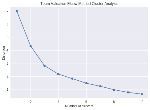
Elbow Plot
- Used to identify ideal cluster number
- Diagnostic tool for Clustering
from sklearn.cluster import KMeans
k_means = KMeans(n_clusters=3)
kmeans = k_means.fit(scaler.transform(numerical_df))
val_housing_win_df['cluster'] = kmeans.labels_
val_housing_win_df.head()
| TEAM | GMS | PCT_ATTENDANCE | WINNING_SEASON | TOTAL_ATTENDANCE_MILLIONS | VALUE_MILLIONS | ELO | CONF | COUNTY | MEDIAN_HOME_PRICE_COUNTY_MILLIONS | COUNTY_POPULATION_MILLIONS | cluster | |
|---|---|---|---|---|---|---|---|---|---|---|---|---|
| 0 | Chicago Bulls | 41 | 104 | 1 | 0.888882 | 2500 | 1519 | East | Cook | 269900.0 | 5.20 | 0 |
| 1 | Dallas Mavericks | 41 | 103 | 0 | 0.811366 | 1450 | 1420 | West | Dallas | 314990.0 | 2.57 | 0 |
| 2 | Sacramento Kings | 41 | 101 | 0 | 0.721928 | 1075 | 1393 | West | Sacremento | 343950.0 | 1.51 | 1 |
| 3 | Miami Heat | 41 | 100 | 1 | 0.805400 | 1350 | 1569 | East | Miami-Dade | 389000.0 | 2.71 | 0 |
| 4 | Toronto Raptors | 41 | 100 | 1 | 0.813050 | 1125 | 1600 | East | York-County | 390000.0 | 1.10 | 0 |
import matplotlib.pyplot as plt
distortions = []
for i in range(1, 11):
km = KMeans(n_clusters=i,
init='k-means++',
n_init=10,
max_iter=300,
random_state=0)
km.fit(scaler.transform(numerical_df))
distortions.append(km.inertia_)
plt.plot(range(1,11), distortions, marker='o')
plt.xlabel('Number of clusters')
plt.ylabel('Distortion')
plt.title("Team Valuation Elbow Method Cluster Analysis")
plt.show()
3.3 Summary Statistics
Used to Describe Data
numerical_df.median()
TOTAL_ATTENDANCE_MILLIONS 0.724902
ELO 1510.500000
VALUE_MILLIONS 1062.500000
MEDIAN_HOME_PRICE_COUNTY_MILLIONS 324199.000000
dtype: float64
numerical_df.max()
TOTAL_ATTENDANCE_MILLIONS 0.889
ELO 1770.000
VALUE_MILLIONS 3300.000
MEDIAN_HOME_PRICE_COUNTY_MILLIONS 1725000.000
dtype: float64
numerical_df.describe()
| TOTAL_ATTENDANCE_MILLIONS | ELO | VALUE_MILLIONS | MEDIAN_HOME_PRICE_COUNTY_MILLIONS | |
|---|---|---|---|---|
| count | 30.000 | 30.000 | 30.000 | 30.000 |
| mean | 0.733 | 1504.833 | 1355.333 | 407471.133 |
| std | 0.073 | 106.843 | 709.614 | 301904.127 |
| min | 0.606 | 1338.000 | 750.000 | 129900.000 |
| 25% | 0.679 | 1425.250 | 886.250 | 271038.750 |
| 50% | 0.725 | 1510.500 | 1062.500 | 324199.000 |
| 75% | 0.801 | 1582.500 | 1600.000 | 465425.000 |
| max | 0.889 | 1770.000 | 3300.000 | 1725000.000 |
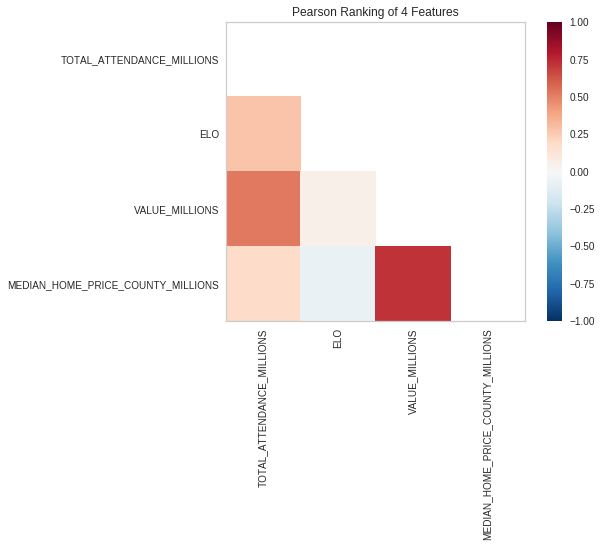
3.4 Implement Heatmap
Used to compare Features
!pip -q install -U yellowbrick
from yellowbrick.features import Rank2D
visualizer = Rank2D(algorithm="pearson")
visualizer.fit_transform(numerical_df)
visualizer.poof()
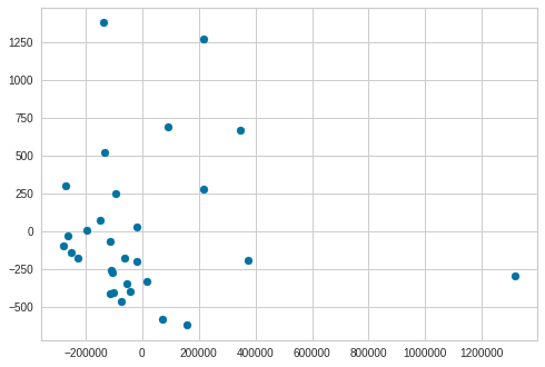
3.5 PCA (Principle Component Analysis)
Reduce Dimensions
- AWS Sagemaker has capabilities
- Deep Learning AMIs can create custom Solution
Use PCA with sklearn
References:
import pandas as pd
from sklearn.decomposition import PCA
pca = PCA(n_components=2)
pca.fit(numerical_df)
X = pca.transform(numerical_df)
print(f"Before PCA Reduction{numerical_df.shape}")
print(f"After PCA Reduction {X.shape}")
Before PCA Reduction(30, 4)
After PCA Reduction (30, 2)
Simple Scatter Plot of Reduced Dimensions
plt.scatter(X[:, 0], X[:, 1])
plt.show()
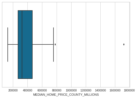
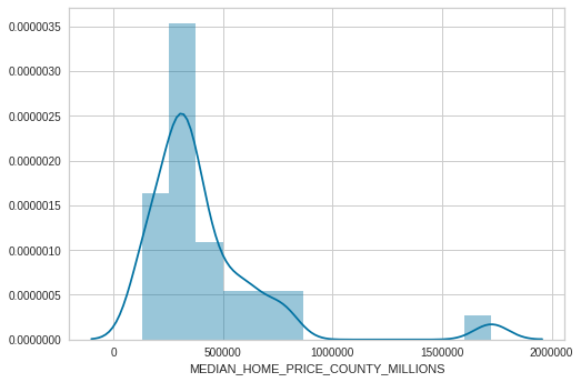
3.6 Data Distributions
Used to show shape and distribution
- What is the skew of the data?
- What modeling should acccount for this?
import seaborn as sns
sns.boxplot(numerical_df['MEDIAN_HOME_PRICE_COUNTY_MILLIONS'])
<matplotlib.axes._subplots.AxesSubplot at 0x7f302361b1d0>
sns.distplot(numerical_df["MEDIAN_HOME_PRICE_COUNTY_MILLIONS"])
<matplotlib.axes._subplots.AxesSubplot at 0x7f30235bc0f0>
3.7 Data Normalizations
Normalize Magnitude of data
- Used to prepare data for Clustering
- Without it distorted results from magnitude of one variable or column
from sklearn.preprocessing import StandardScaler
StandardScaler?
from sklearn.preprocessing import MinMaxScaler
scaler = StandardScaler()
print(scaler.fit(numerical_df))
print(scaler.transform(numerical_df))
StandardScaler(copy=True, with_mean=True, with_std=True)
[[ 2.15710914 0.13485945 1.6406603 -0.46346815]
[ 1.08262637 -0.80757014 0.13568652 -0.31156289]
[-0.1571124 -1.0645964 -0.40180411 -0.21399854]
[ 0.99992906 0.610834 -0.00764431 -0.06222804]
[ 1.10596902 0.90593821 -0.33013869 -0.05885911]
[ 0.68401316 1.24863989 0.92400612 0.73284052]
[ 1.52170109 0.38236622 -0.22264057 -0.90951509]
[ 0.97270521 2.52425166 1.78399114 1.17076833]
[ 0.18103723 0.36332724 -0.47346953 -0.66676145]
[ 1.07396297 -1.24546672 2.78730699 4.43866857]
[ 0.38018443 0.78218483 1.2106678 0.30835476]
[ 0.60511389 -1.31210316 2.35731448 0.73284052]
[ 0.81458785 0.55371705 -0.43763682 0.05804292]
[ 0.3061228 1.48662716 -0.25847327 -0.4968206 ]
[ 1.01663209 1.06776956 -0.63829999 -0.18367813]
[-0.07467847 -1.45489552 -0.62396691 -0.36240011]
[-0.97256659 -0.21736171 -0.86762933 -0.37890789]
[-0.51785617 0.9249772 0.4223482 -0.44812265]
[-0.34131697 -1.56912941 -0.3659714 -0.37890789]
[-0.67483689 0.20149589 -0.68129924 -0.88424808]
[-0.77552634 -0.21736171 -0.81029699 -0.85055873]
[-0.31353866 -0.39823203 -0.82463008 -0.34523707]
[-0.31473075 -1.58816839 -0.79596391 -0.76633537]
[-1.09445017 -0.24592018 -0.6741327 -0.14308247]
[-1.39521552 -1.2645057 0.63734445 1.25502538]
[-1.16866427 -0.02697189 -0.81746354 -0.93511899]
[-0.50116701 0.78218483 -0.50930224 0.53390494]
[-1.769793 0.44900265 -0.66696616 0.24097607]
[-1.74736521 -0.39823203 -0.83896316 -0.24951385]
[-1.08287587 -0.60766083 -0.65263307 -0.36209691]]
3.8 Data Preprocessing
Encoding Categorical Variables
- Categorical (Discreet) Variables
- finite set of values:
{green, red, blue}or{false, true}
- finite set of values:
- Categorical Types:
- Ordinal (ordered):
{Large, Medium, Small} - Nominal (unordered):
{green, red, blue}
- Ordinal (ordered):
- Represented as text
[Demo] Pandas preprocessing w/ Apply Function
import pandas as pd
import seaborn as sns
import matplotlib.pyplot as plt
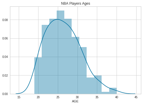
df = pd.read_csv("https://raw.githubusercontent.com/noahgift/socialpowernba/master/data/nba_2017_players_with_salary_wiki_twitter.csv")
sns.distplot(df.AGE)
plt.legend()
plt.title("NBA Players Ages")
Text(0.5,1,'NBA Players Ages')
def age_brackets (age):
if age >17 and age <25:
return 'Rookie'
if age >25 and age <30:
return 'Prime'
if age >30 and age <35:
return 'Post Prime'
if age >35 and age <45:
return 'Pre-Retirement'
df.columns
Index(['Unnamed: 0', 'Rk', 'PLAYER', 'POSITION', 'AGE', 'MP', 'FG', 'FGA',
'FG%', '3P', '3PA', '3P%', '2P', '2PA', '2P%', 'eFG%', 'FT', 'FTA',
'FT%', 'ORB', 'DRB', 'TRB', 'AST', 'STL', 'BLK', 'TOV', 'PF', 'POINTS',
'TEAM', 'GP', 'MPG', 'ORPM', 'DRPM', 'RPM', 'WINS_RPM', 'PIE', 'PACE',
'W', 'SALARY_MILLIONS', 'PAGEVIEWS', 'TWITTER_FAVORITE_COUNT',
'TWITTER_RETWEET_COUNT'],
dtype='object')
df["age_category"] = df["AGE"].apply(age_brackets)
df.groupby("age_category")["SALARY_MILLIONS"].median()
age_category
Post Prime 8.550
Pre-Retirement 5.500
Prime 9.515
Rookie 2.940
Name: SALARY_MILLIONS, dtype: float64